
Stock Performance Grapher
It's been quite a while since my last post, I have been busy with school. Today I have a small script I put together a few days ago that tracks your individual stock performance and graphs them all in a single graph.
I'm a big fan of data, the more the better. My biggest gripe with stock brokers is their often restricted statistical insights into how your portfolio is doing. Most of them just give a single number depicting your current total portfolio value, as well as a graph to show the progress. Even worse than that, the deposits are usually included in the graph, which makes it very difficult to get any meaningful insight on your progression.
I decided to make a python script that takes an input of all the transactions you've made, calculates your earnings over time, and graphs each security on a separate line for viewing. It is quite limited in its current state, it only shows the net dollar gain and not the percentage gain (as well as numerous other small details), but I intended it as a small script to code on the side so I'm likely going to leave it as it is.
Input
The input to this is a single "trades.csv" file which contains lines given in the following format:
// date,action,stock,price,count,rate?
121820,buy,abc,8404,10
121820,buy,def,533,28,13180
123020,sell,abc,8607,10
...
...
| Key | Explanation |
|---|---|
| date | The date the stock was purchased, given in "MMDDYY" format (YY is the last two digits of the year). IMPORTANT: single digits must be padded with a zero (4 -> 04) |
| action | Either "buy" or "sell" |
| stock | The ticker for the stock involved in the action |
| price | The price the stock was sold/bought at |
| rate | An optional value that indicates the conversion rate used |
To account for decimals, the price is multiplied by 100 and the rate is multiplied by 10000 (the reason for this was initially to account for decimal rounding errors but I ended up getting lazy and not fully implementing that, so this is an artifact of that initial design choice).
I'm Canadian, so I found it useful to include a "rate" value that indicates the USD to CAD conversion at the time of purchase.
The graph
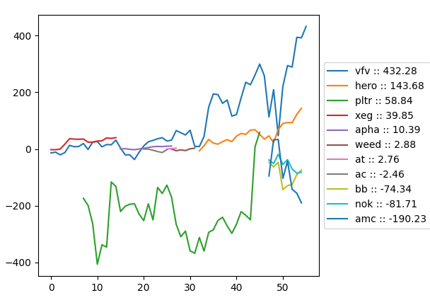 This is the output the script creates. A graph where each security is graphed on its own line. Notice how some lines start and end at different points on the graph, indicating when that security was bought/sold compared to the other securities.
The x axis represents the number of business days from start to finish.
On the right, a legend can be seen that has the total net gain for each security as well as the color for it.
It's also possible to graph your total net value overall, but I find it to be too cluttering to use as a good example.
(thank you to Dave for letting me use his share transactions as input)
Future steps
I don't plan on working on this anymore, but if anyone wants to expand on it, I thought of some ideas that I've listed down below.
- Using a dotted line to represent a stock before/after the user owned shares of it. This could be used in "what if" scenarios, like "what if I held on another 2 weeks", or "what if I bought a few days earlier".
- A "worst-case" percentage, that would show the difference in value between selling at the worst possible time during a user's ownership of some shares and the time the user actually sold. Alternatively a "best-case" percentage that shows the difference between when the user sold and when would have been the best time to sell.
- Buttons to toggle line visibility (fairly simple to add in matplotlib, I just didn't want to overcomplicate the demo).
Important variables
If you want to use this yourself, you'll likely need to change some global variables in the code.
| variable | location | purpose |
|---|---|---|
ISUSD |
stockview.py | a list containing stocks that need to be converted to USD |
USDTOCAD |
stockview.py | an int representing the current conversion rate from USD to CAD |
TRANSLATE |
grapher.py | a dictionary that replaces ticker names (useful because the stock market API prefers having ".TO" affixed to toronto ticker names, but it looks ugly to keep writing that in the csv file) |
ENDDATE |
grapher.py | a datetime object representing the day the graph should be drawn up until (not inclusive) |
Download
Available on github.